Custom websites | Smotly
Strategic UX/UI design
Designs that tell your story and turn your visitors into loyal customers
Your website's web design
Between efficiency and emotion
At Smotly, we design interfaces that go far beyond aesthetics. Our expertise in UX/UI design combines creativity and methodology to create digital experiences that perfectly reflect your brand identity while maximizing your conversion rates. We turn every interaction into an opportunity to seduce, retain and convert your users.
To find out more about UX (user experience) and UI (user interface), read our article.
Our UX/UI signature: creativity at the service of conversion
At Smotly, we've developed a strategic vision of web design to create interfaces that are as beautiful as they are effective, and turn them into real performance drivers. Our distinctive approach is based on five fundamental principles:
Design as a strategic lever
We see design as a strategic investment that must generate a measurable return. Every visual element, every interaction is designed with a precise objective in mind: to improve your conversion, strengthen your brand image and build user loyalty.
The perfect balance between creativity and data
We combine creative expertise and data analysis to create interfaces that are both aesthetically pleasing and functionally efficient. This hybrid approach guarantees designs that appeal to both users and search engine algorithms.
Co-creation at the heart of the process
We firmly believe in the power of co-creation. Your business expertise combined with our technical know-how enables us to design user paths that are perfectly aligned with your business objectives and your audience's expectations.
Integrated technical excellence
Our work takes into account best practices and rules in terms of user experience and interface: responsive design, accessibility, SEO, eco-design. Integrating these technical constraints right from the start of the design phase ensures interfaces that are as technically efficient as they are aesthetically pleasing.
A sustainable, scalable vision
We design interfaces that stand the test of time and can grow with your business. Our modular approach facilitates future upgrades and adaptations, maximizing the sustainability of your investment.
What our UX/UI design means for you in concrete terms
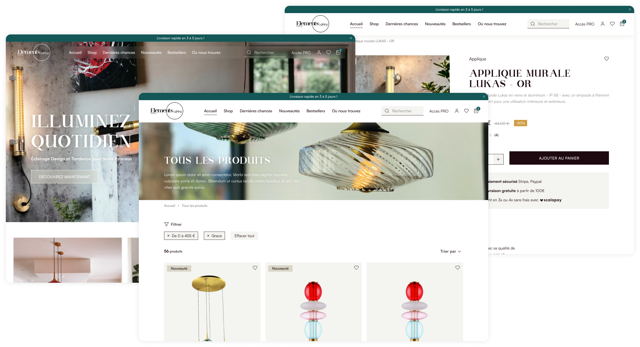
Un design sur-mesure qui renforce votre identité
Nous créons des webdesign uniques qui reflètent parfaitement votre ADN de marque loin des templates génériques. Chaque élément visuel est pensé pour renforcer votre positionnement et créer une expérience mémorable qui vous distingue de la concurrence.
Des parcours optimisés pour la conversion
Nous concevons des interfaces qui guident naturellement vos utilisateurs vers les actions souhaitées. Notre approche stratégique du design transforme chaque page en un outil de conversion efficace, augmentant significativement vos taux de transformation.
Une expérience utilisateur intuitive et engageante
Nous créons des designs qui anticipent les besoins de vos utilisateurs pour réduire les frictions et augmenter l’engagement. Notre design centré sur l’humain garantit une prise en main immédiate et une satisfaction maximale.
Une accessibilité optimale pour tous
Nous intégrons systématiquement les standards d’accessibilité (WCAG) dans notre processus de conception, assurant que vos interfaces sont utilisables par tous, y compris les personnes en situation de handicap. Cette approche inclusive élargit votre audience potentielle.
Our step-by-step UX/UI methodology
🔎
01.
An intuitive and engaging user experience
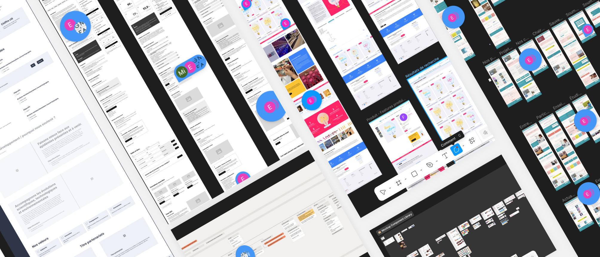
We start with an in-depth exploration phase: brand analysis, competitor study, user interviews and definition of strategic objectives. Together, we create your priority personas to define the value proposition and the major axes to be integrated into user journeys. Miro, a collaborative tool, is generally used during this phase. This stage is essential and guides the entire design process.
🎯
02.
Information architecture
We structure your content in a logical and intuitive way. The tree structure, menu and site map are challenged to create a hierarchy of information that facilitates navigation and comprehension. This step optimizes the user experience and natural referencing.
🚀
03.
Wireframing & prototyping
We design wireframes to visualize the structure and organization of your interfaces, followed by interactive prototypes to test user paths before development. We create the structure of identified pages according to their typology: single page or template page, which can be duplicated to highlight different information in a consistent manner.
💡
04.
UI design& graphic charter
Once the wireframes have been validated, we move on to "colorizing" the pages to bring the mock-ups to life. We pay particular attention to detail: typography, color palette, iconography and customized interface components that reflect your brand. At the end of this phase, we have a mock-up of all the pages.
🔄
05.
Collaborations and feedback
As we make progress, you can consult the mock-ups on Figma in real time, and send us your comments for immediate application. This iterative approach guarantees web designs that are constantly optimized for performance and user satisfaction, but above all, that meet your requirements.
🔨
06.
Design system
We develop a complete design system that documents all visual elements and interactions, ensuring consistency and scalability for your future interfaces.
Why choose Smotly web agency?
Recognized expertise in UX/UI
Our team of designers combines academic training with hands-on experience in designing high-performance interfaces for a wide range of sectors. We master the latest trends and best practices in digital design, from showcase sites to e-commerce sites and business platforms.
High-performance, high-impact web design
Beautiful web design is one thing, but it's not everything! Our expertise guarantees unique AND high-performance web design: SEO and technical considerations, compliance with accessibility, responsive design and eco-design constraints.
A mastery of responsive design
Your site needs to adapt to all screen sizes, and in particular to small screens. In 2025, mobile usage will be predominant, with nearly 94% of Internet users accessing the web via their smartphone. Our team attaches real importance to these formats, producing mobile-first mock-ups, mobile system design and/or mobile versions of key pages, as required.
A commitment to eco-design
We systematically apply the principles of digital eco-design to reduce your site's environmental footprint while optimizing its performance. As a shareholder in Team for the Planet and a member of Team Green IT, we integrate responsible practices into every project: limiting resource use, functional sobriety, asset optimization and reducing server requests. Because digital performance and positive impact are not mutually exclusive.
Transparent collaboration: a single team
We involve you at every stage of the creative process through workshops and collaborative tools, giving you access to elements in real time. By combining our technical skills in terms of UI/UX, our knowledge of your market and your business expertise, everything is conducive to the creation of optimal user paths with a web design that reflects your brand image.
Frequently asked questions
Our most frequently asked questions
How do you guarantee the accessibility of your interfaces?
We integrate WCAG 2.1 standards right from the start of our design process, and rigorously test our interfaces with accessibility audit tools. We pay particular attention to color contrasts, keyboard navigation, and compatibility with screen readers to ensure an inclusive experience.
How do you reconcile brand identity with good UX practices?
We start by gaining a deep understanding of your brand universe, then adapt it to digital while respecting the fundamental principles of user experience. Our creative approach strikes the right balance between expressing your identity and optimizing usability.
Do you offer mobile-first designs?
Absolutely! We take into account your analytics to identify the devices most used by your target audience. We then systematically adopt a "mobile-first" approach to our design phase to ensure an optimal experience on mobile devices, while progressively enriching the interface for larger screens. This method ensures optimal performance on all terminals and is perfectly aligned with modern search engine indexing strategies.
How do you integrate eco-design principles into your designs?
We systematically optimize the weight of visual assets, limit non-essential animations, and favor design choices that reduce energy consumption. Our interfaces are designed to minimize server requests while maximizing user-perceived performance.
Your site deserves more than just a "pretty" design
Let's discuss your challenges in a no-obligation initial discussion